 LayMesh
Getting started with styles and libraries#
Start with style and animation libraries: learn bundled libraries, sources and imports, then explore entries, parameters and composition. One .lay file is enough to begin.
Style manual · Next: Selectors, variables and cascade
Separate appearance from placement#
The .lay file supplies page and object sizes, data, anchors and positions. LCSS supplies reusable typography, colors, borders, corners and effects. Space-separated classes combine appearances; explicit parameters handle individual exceptions and take priority.
page = canvas(size=(80mm,50mm))style { .card { background:#eff6ff; border:0.5pt solid #0d6efd; border-radius:2mm; }}page.add(rect(size=(30mm,20mm),class="card"),anchor=center,target=page.center)Inside the style block, use CSS-style declarations. Outside it, use Lay syntax. The class argument contains names without the selector's leading dot.
Files and relative resources#
Keep repeated declarations in theme.lcss and load it with canvas(stylesheet="theme.lcss"). Imports, fonts and images are relative to the file containing their declaration. Preserve the theme and its dependencies when sharing a project.
/* theme.lcss */@import "@laymesh/bootstrap.css";@import "@laymesh/open-props.css";.card { background:var(--gradient-7); border-radius:var(--radius-3); box-shadow:var(--shadow-3);}An ordered stylesheet list is also supported:
page = canvas(size=(80mm,50mm), stylesheet=["@laymesh/bootstrap.css","theme.lcss"])page.add(rect(size=(30mm,20mm),class="card"),anchor=center,target=page.center)Files load in list order; entry inline declarations follow external files. Later source order wins only after importance and specificity have been compared.
Offline libraries#
| Pinned library | Import path | Purpose |
|---|---|---|
| Bootstrap 5.3.8 | @laymesh/bootstrap.css | Appearance utility classes |
| Open Props 1.7.23 | @laymesh/open-props.css | Color, radius, gradient and shadow variables |
| Animate.css 4.1.1 | @laymesh/animate.css | Animation classes and keyframes |
Native, Python, WASM and VS Code use the same distributed files without network downloads. All three require explicit imports; naming animate__fadeInUp does not load Animate.css. Original sources, licenses and SHA-256 are in the resource manifest.
Bootstrap appearance classes#
| Classes | Appearance |
|---|---|
| bg-primary, bg-success | Background colors |
| text-primary | Text color |
| border, border-primary | Border and border color |
| rounded | Rounded corners |
| shadow-sm, shadow, shadow-lg | Box shadows |
| fw-bold, fst-italic | Font weight and style |
Use class="bg-primary rounded shadow" to combine appearances. Web width/height, margins, flex and grid do not position LayMesh objects; continue to set physical size and anchor relationships in .lay.
Open Props and local themes#
Apply variables to supported properties: --blue-7 to color, --radius-3 to corners, --gradient-7 to background and --shadow-3 to box-shadow. A defined variable can still expand to an unsupported property value, invalidating that declaration.
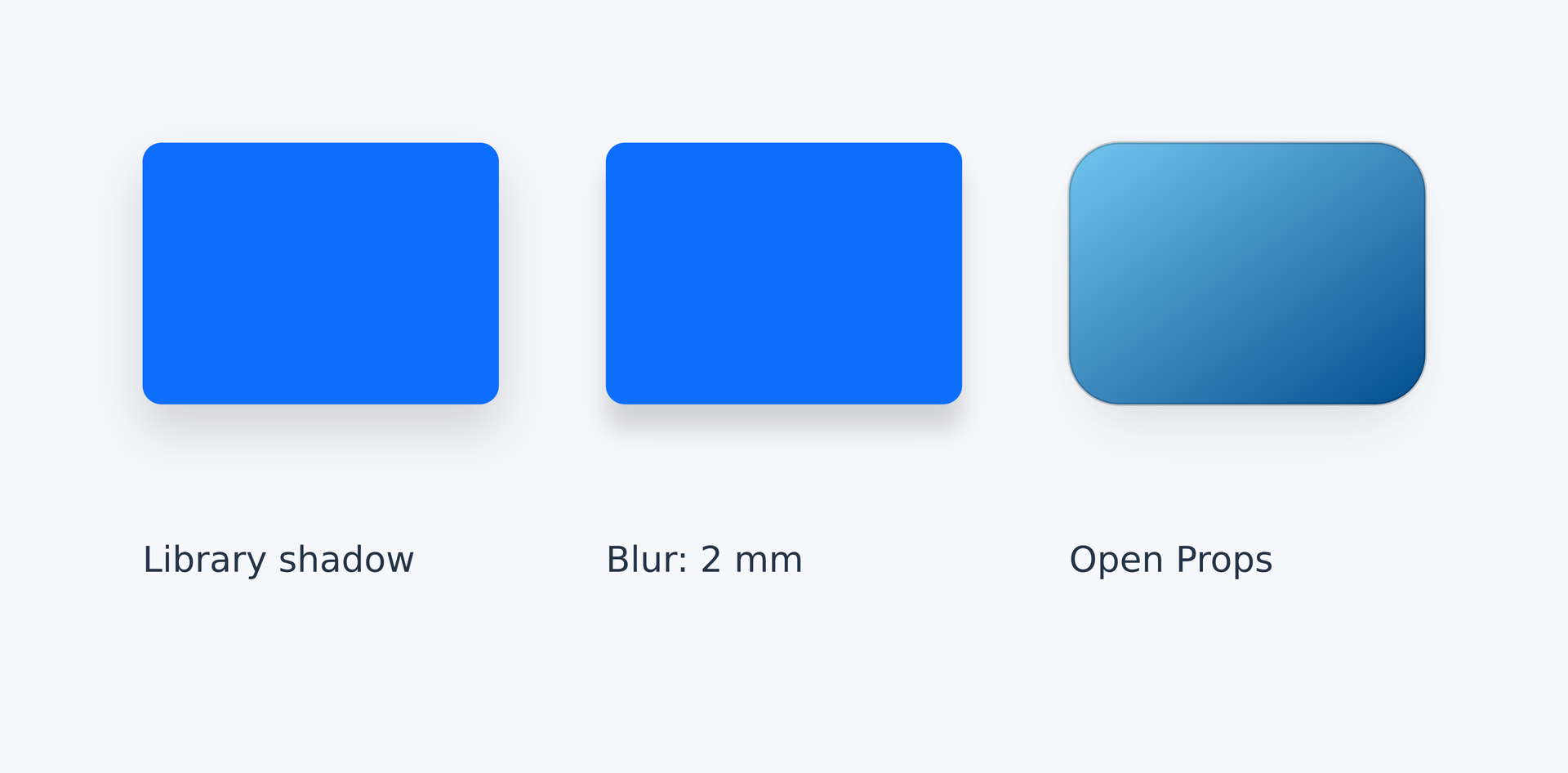
This complete project shares one theme. Its second card changes only the Bootstrap blur radius to 2mm. Use the file tabs below to edit the page and stylesheet together.
page = canvas(size=(132mm,65mm), stylesheet="style-theme.lcss", background="#f6f7fb")card_size = (30mm,22mm)gap = 9mmlibrary = page.add(rect(size=card_size,class="bg-primary rounded shadow"), target=page.top_left,offset=(12mm,12mm))custom = page.add(rect(size=card_size,class="bg-primary rounded shadow custom"), target=library.top_right,offset=(gap,0mm))props = page.add(rect(size=card_size,class="card ocean"), target=custom.top_right,offset=(gap,0mm))for card,label in [(library,"Library shadow"),(custom,"Blur: 2 mm"),(props,"Open Props")] { page.add(text(label,class="caption"),target=card.bottom_left,offset=(0mm,gap))}@import "@laymesh/bootstrap.css";@import "@laymesh/open-props.css";:root { --ink: #243447; font-size: 16px; }.card { padding: 1mm; border-radius: var(--radius-3); }.ocean { background: var(--gradient-7); box-shadow: var(--shadow-3); }.caption { font-size: 3mm; color: var(--ink); }.shadow.custom { box-shadow-blur: 2mm !important; }Preview
Dependencies
examples/manual/style-project.layexamples/manual/style-theme.lcss
The first card sets its page margin relative to page.top_left. Subsequent cards follow top_right, and each label follows its card's bottom_left. card_size and gap control dimensions and spacing: change width from 30mm to 26mm and the following cards and labels move with their anchors. Themes save appearance, loops remove repetition, and anchors save layout relationships. See placement and loops/functions.
Anchors align layout bounds; shadows do not increase card spacing. A fixed canvas does not grow automatically, so check its boundary after enlarging content. Coordinates remain useful for local paths, plot data and the first page margin; repeated objects should retain alignment and spacing relationships.
Compatibility warnings#
Unmodified upstream CSS contains web features that LayMesh has not implemented. One W_CSS summary per file reports ignored declarations while supported appearance remains active. Missing files and import cycles are errors; see Compatibility and troubleshooting.
Complete styled animation projects#
Library cards and artistic poster combine themes, layout, keyframes and steps, with complete source for the existing complex dashboard.