 LayMesh
Appearance properties and units#
Style manual · Next: Shadows and effects
Physical and relative units#
Lengths accept mm/cm/in/inch/pt/px and CSS pc/q. Nonzero lengths require units; zero may omit them. Angles accept deg/rad/grad/turn and time accepts s/ms. Default units on .lay parameters do not make unitless CSS lengths valid.
px uses canvas layout_dpi: 1px = 25.4/layout_dpi mm, default 96. Static styles and animation share that context. Export DPI changes pixel density without changing physical fonts, shadows or page dimensions.
| Unit | Reference |
|---|---|
| em | Computed element font size; font-size itself uses its parent's size |
| rem | Root font size, or 16 layout px if unspecified |
| vw/vh | 1% of fixed canvas width/height |
| vmin/vmax | 1% of its smaller/larger dimension |
calc() preserves dimensions; min(), max() and clamp() compare compatible values. clamp(3mm,1.1rem,5mm) limits the preferred font size to 3–5mm. calc(1mm + 0.2em) combines fixed and font-relative padding. Percentages require a property-specific reference: corners use object dimensions; animated translation and origin use the untransformed layout box.
Colors and fills#
Accept named colors, hex RGB/RGBA, RGB percentages and alpha, HSL, and LayMesh HSV/OKLCH. transparent is transparent; currentColor uses the computed text color. color controls text, fill controls a closed shape's interior, and background controls its region.
Single linear/radial gradients, hatch(slash|cross|dots,...) and url("texture.png") are supported. Multiple backgrounds, conic gradients and unimplemented interpolation color spaces are not. The corresponding DSL constructors are linear_gradient, radial_gradient, hatch and image_fill.
.card { color:hsl(210 40% 25%); background:linear-gradient(120deg,#60a5fa,#075985); border:0.5pt solid currentColor; border-radius:2mm; opacity:0.9;}Typography, borders and padding#
Font families are searched in order among installed or supplied fonts; file paths resolve relative to the stylesheet. Missing glyphs warn and draw boxes. Preserve font files when sharing reproducible projects.
font shorthand includes style, weight, size, optional line height and family. In LCSS, line-height:1.4 is a font-size multiplier, while line-height:5mm is a physical height.
Closed contours use border-* and open strokes use line-*. border:0.5pt solid #94a3b8 expands width, style and color. Source order still participates in the cascade. Corners currently use a uniform radius, with a single percentage resolved against the layout box.
padding accepts one, two (vertical/horizontal), three (top/horizontal/bottom) or four (top/right/bottom/left) values. It contributes to measured bounds without introducing browser automatic layout. opacity, border-opacity and line-opacity affect separate levels.
page = canvas(size=(132mm,65mm), stylesheet="style-theme.lcss", background="#f6f7fb")card_size = (30mm,22mm)gap = 9mmlibrary = page.add(rect(size=card_size,class="bg-primary rounded shadow"), target=page.top_left,offset=(12mm,12mm))custom = page.add(rect(size=card_size,class="bg-primary rounded shadow custom"), target=library.top_right,offset=(gap,0mm))props = page.add(rect(size=card_size,class="card ocean"), target=custom.top_right,offset=(gap,0mm))for card,label in [(library,"Library shadow"),(custom,"Blur: 2 mm"),(props,"Open Props")] { page.add(text(label,class="caption"),target=card.bottom_left,offset=(0mm,gap))}@import "@laymesh/bootstrap.css";@import "@laymesh/open-props.css";:root { --ink: #243447; font-size: 16px; }.card { padding: 1mm; border-radius: var(--radius-3); }.ocean { background: var(--gradient-7); box-shadow: var(--shadow-3); }.caption { font-size: 3mm; color: var(--ink); }.shadow.custom { box-shadow-blur: 2mm !important; }Preview
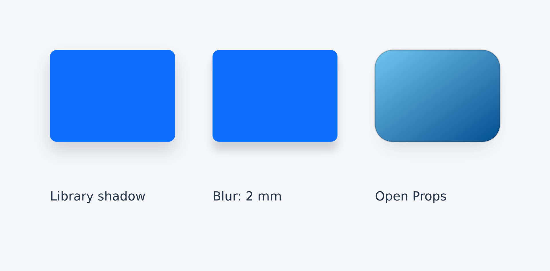
Dependencies
examples/manual/style-project.layexamples/manual/style-theme.lcss
Individual properties#
Each static property below specifies values, units, default behavior, inheritance, applicable objects and an example declaration. Object-specific properties apply only to compatible material. Unlisted defaults come from that material. Animation properties are covered in Keyframes and CSS animation.
font-family#
System family, font file path or ordered list. No body fonts are bundled; missing glyphs warn and render as boxes.
Accepted values: string | string[].
Units: none.
Default: system sans-serif. Inherited.
Applies to: Text and formulas.
.sample { font-family: "DejaVu Sans", sans-serif; }math-font#
Math font: ratex-katex by default, or an installed font name / file path with an OpenType MATH table. Legacy mathjax-* names warn and map to the default.
Accepted values: string.
Units: none.
Default: ratex-katex (inherit). Inherited.
Applies to: Text and formulas.
.sample { math-font: ratex-katex; }math-text-fallback#
Shape formula text with font_family and text fallback using actual glyph metrics; false checks only math-font coverage. Mathematical symbols retain math_font.
Accepted values: boolean.
Units: none.
Default: true (inherit). Inherited.
Applies to: Text and formulas.
.sample { math-text-fallback: true; }font-size#
Font size; nonzero CSS lengths require units. Inherits when omitted; em and percentages use the parent font size.
Accepted values: length.
Units: explicit mm/cm/in/inch/pt/px or CSS relative units; px uses layout_dpi.
Default: 继承 / inherit. Inherited.
Applies to: Text and formulas.
.sample { font-size: 4mm; }font-weight#
Font weight from 1 to 1000; normal=400, bold/bolder=700 and lighter=300. Relative weight keywords currently use these fixed mappings.
Accepted values: number | keyword.
Units: none.
Default: 400. Inherited.
Applies to: Text and formulas.
.sample { font-weight: 700; }font-style#
normal, italic or oblique; oblique currently maps to italic.
Accepted values: enum: normal, italic, oblique.
Units: none.
Default: normal. Inherited.
Applies to: Text and formulas.
.sample { font-style: italic; }color#
Text color; currentColor lets borders and shadows use the computed color.
Accepted values: color.
Units: none.
Default: #555555. Inherited.
Applies to: Text and formulas.
.sample { color: #243447; }line-height#
An explicit length or unitless font-size multiplier; defaults to 1.2 times font size.
Accepted values: length | number.
Units: explicit mm/cm/in/inch/pt/px or CSS relative units; px uses layout_dpi.
Default: 1.2 × font_size. Inherited.
Applies to: Open strokes.
.sample { line-height: 1.4; }background#
Background paint for the object region, separate from text or lines
Accepted values: paint.
Units: none.
Default: none. Not inherited.
Applies to: Drawable object regions; target support depends on material.
.sample { background: linear-gradient(120deg, #60a5fa, #075985); }padding#
Inner spacing; 1–4 CSS lengths follow all, vertical/horizontal, top/horizontal/bottom, or top/right/bottom/left ordering.
Accepted values: length | length[].
Units: explicit mm/cm/in/inch/pt/px or CSS relative units; px uses layout_dpi.
Default: 0. Not inherited.
Applies to: Drawable object regions; target support depends on material.
.sample { padding: 1mm 2mm 1mm 2mm; }border-radius#
Uniform box corner radius; nonzero lengths need units and percentages use the layout box. Separate corners and elliptical radii are unsupported.
Accepted values: length.
Units: explicit mm/cm/in/inch/pt/px or CSS relative units; px uses layout_dpi.
Default: 0. Not inherited.
Applies to: Drawable object regions; target support depends on material.
.sample { border-radius: 2mm; }border-color#
Closed-outline color; none disables the border
Accepted values: color.
Units: none.
Default: none. Not inherited.
Applies to: Drawable object regions; target support depends on material.
.sample { border-color: #94a3b8; }border-width#
Closed-outline width; nonzero CSS lengths need units. thin/medium/thick mean 1/3/5 layout px.
Accepted values: length.
Units: explicit mm/cm/in/inch/pt/px or CSS relative units; px uses layout_dpi.
Default: Material default. Not inherited.
Applies to: Drawable object regions; target support depends on material.
.sample { border-width: 0.5pt; }border-style#
Border line pattern, independent of fill
Accepted values: enum: none, solid, dashed, dotted, dash_dot, double, triple.
Units: none.
Default: solid. Not inherited.
Applies to: Drawable object regions; target support depends on material.
.sample { border-style: solid; }border-dash#
Alternating border dash and gap CSS lengths; paired values with units on nonzero lengths.
Accepted values: length[].
Units: explicit mm/cm/in/inch/pt/px or CSS relative units; px uses layout_dpi.
Default: Material default. Not inherited.
Applies to: Drawable object regions; target support depends on material.
.sample { border-dash: 2mm 1mm; }border-dash-offset#
Border dash phase; a signed CSS length, with units required for nonzero values.
Accepted values: length.
Units: explicit mm/cm/in/inch/pt/px or CSS relative units; px uses layout_dpi.
Default: 0. Not inherited.
Applies to: Drawable object regions; target support depends on material.
.sample { border-dash-offset: 0.5mm; }border-cap#
Outline dash endpoint shape
Accepted values: enum: butt, round, square.
Units: none.
Default: butt. Not inherited.
Applies to: Drawable object regions; target support depends on material.
.sample { border-cap: round; }border-join#
Outline join
Accepted values: enum: miter, round, bevel.
Units: none.
Default: miter. Not inherited.
Applies to: Drawable object regions; target support depends on material.
.sample { border-join: round; }border-miter-limit#
Maximum miter extension relative to line width
Accepted values: value.
Units: none.
Default: 4. Not inherited.
Applies to: Drawable object regions; target support depends on material.
.sample { border-miter-limit: 4; }border-opacity#
Independent border opacity, 0–1
Accepted values: value.
Units: none.
Default: 1. Not inherited.
Applies to: Drawable object regions; target support depends on material.
.sample { border-opacity: 0.7; }line-color#
Open-line color; defaults to series or theme color
Accepted values: color.
Units: none.
Default: Material default. Not inherited.
Applies to: Open strokes.
.sample { line-color: #0d6efd; }line-width#
Open-line width; nonzero CSS lengths need units. thin/medium/thick mean 1/3/5 layout px.
Accepted values: length.
Units: explicit mm/cm/in/inch/pt/px or CSS relative units; px uses layout_dpi.
Default: Material default. Not inherited.
Applies to: Open strokes.
.sample { line-width: 0.7pt; }line-style#
Line pattern; double/triple retain transparent gaps
Accepted values: enum: none, solid, dashed, dotted, dash_dot, double, triple.
Units: none.
Default: solid. Not inherited.
Applies to: Open strokes.
.sample { line-style: solid; }line-dash#
Alternating dash and gap CSS lengths; nonzero lengths require units.
Accepted values: length[].
Units: explicit mm/cm/in/inch/pt/px or CSS relative units; px uses layout_dpi.
Default: Material default. Not inherited.
Applies to: Open strokes.
.sample { line-dash: 2mm 1mm; }line-dash-offset#
Line dash phase; a signed CSS length, with units required for nonzero values.
Accepted values: length.
Units: explicit mm/cm/in/inch/pt/px or CSS relative units; px uses layout_dpi.
Default: 0. Not inherited.
Applies to: Open strokes.
.sample { line-dash-offset: 0.5mm; }line-cap#
Open endpoint shape
Accepted values: enum: butt, round, square.
Units: none.
Default: butt. Not inherited.
Applies to: Open strokes.
.sample { line-cap: round; }line-join#
Line segment join
Accepted values: enum: miter, round, bevel.
Units: none.
Default: miter. Not inherited.
Applies to: Open strokes.
.sample { line-join: round; }line-miter-limit#
Maximum miter extension relative to line width
Accepted values: value.
Units: none.
Default: 4. Not inherited.
Applies to: Open strokes.
.sample { line-miter-limit: 4; }line-opacity#
Independent line opacity, 0–1
Accepted values: value.
Units: none.
Default: 1. Not inherited.
Applies to: Open strokes.
.sample { line-opacity: 0.8; }fill#
Interior color, gradient, hatch or image paint; none disables fill.
Accepted values: paint.
Units: none.
Default: none. Not inherited.
Applies to: Drawable object regions; target support depends on material.
.sample { fill: #dbeafe; }opacity#
Object opacity from 0 to 1; multiplied by ancestor opacity.
Accepted values: value.
Units: none.
Default: 1. Not inherited.
Applies to: Drawable object regions; target support depends on material.
.sample { opacity: 0.8; }tick-font-size#
Tick-label font size; an explicit CSS length, inheriting font size by default.
Accepted values: length.
Units: explicit mm/cm/in/inch/pt/px or CSS relative units; px uses layout_dpi.
Default: 继承字号 / inherit font_size. Not inherited.
Applies to: Plot axes and their labels/grid.
.sample { tick-font-size: 8pt; }label-font-size#
Axis-label font size; an explicit CSS length, inheriting font size by default.
Accepted values: length.
Units: explicit mm/cm/in/inch/pt/px or CSS relative units; px uses layout_dpi.
Default: 继承字号 / inherit font_size. Not inherited.
Applies to: Plot axes and their labels/grid.
.sample { label-font-size: 10pt; }tick-color#
Tick and tick-label color
Accepted values: color.
Units: none.
Default: Material default. Not inherited.
Applies to: Plot axes and their labels/grid.
.sample { tick-color: #243447; }grid-color#
Grid-line color
Accepted values: color.
Units: none.
Default: #dddddd. Not inherited.
Applies to: Plot axes and their labels/grid.
.sample { grid-color: #cbd5e1; }grid-line-width#
Grid width; an explicit CSS length, defaulting to 0.3pt.
Accepted values: length.
Units: explicit mm/cm/in/inch/pt/px or CSS relative units; px uses layout_dpi.
Default: 0.3pt. Not inherited.
Applies to: Plot axes and their labels/grid.
.sample { grid-line-width: 0.3pt; }grid-line-dash#
Grid dash and gap lengths; units are required on nonzero CSS lengths.
Accepted values: value.
Units: none.
Default: []. Not inherited.
Applies to: Plot axes and their labels/grid.
.sample { grid-line-dash: 1mm 1mm; }start-head#
Start head configuration; absent by default
Accepted values: head.
Units: none.
Default: Material default. Not inherited.
Applies to: Open strokes.
.sample { start-head: head(shape="open",size=(3mm,2mm)); }end-head#
End head configuration; absent by default
Accepted values: head.
Units: none.
Default: Material default. Not inherited.
Applies to: Open strokes.
.sample { end-head: head(shape="triangle",size=(3mm,2mm)); }start-cap#
Independent endpoint cap; inherits line_cap
Accepted values: enum: butt, round, square.
Units: none.
Default: line_cap. Not inherited.
Applies to: Open strokes.
.sample { start-cap: round; }end-cap#
Independent endpoint cap; inherits line_cap
Accepted values: enum: butt, round, square.
Units: none.
Default: line_cap. Not inherited.
Applies to: Open strokes.
.sample { end-cap: square; }text-fill#
字形填充 / Glyph paint; defaults to color
Accepted values: paint.
Units: none.
Default: Material default. Not inherited.
Applies to: Text and formulas.
.sample { text-fill: #0d6efd; }text-stroke-color#
字形描边颜色 / Glyph stroke color
Accepted values: color.
Units: none.
Default: none. Not inherited.
Applies to: Text and formulas.
.sample { text-stroke-color: #ffffff; }text-stroke-width#
字形描边宽度 / Glyph stroke width
Accepted values: length.
Units: explicit mm/cm/in/inch/pt/px or CSS relative units; px uses layout_dpi.
Default: 0. Not inherited.
Applies to: Text and formulas.
.sample { text-stroke-width: 0.3pt; }effects#
Shadow, glow, reflection and soft-edge effects
Accepted values: effect[].
Units: none.
Default: []. Not inherited.
Applies to: Drawable object regions; target support depends on material.
.sample { effects: [shadow(blur=1mm,offset=(1mm,2mm))]; }path#
One open path material with its original curve segments preserved; source endpoints are necks and tips extend outward
Accepted values: material.
Units: none.
Default: Material default. Not inherited.
Applies to: Arrow shapes and endpoints.
.sample { path: path(commands=[move_to(0,0),line_to(20mm,10mm)]); }path is a LayMesh constructor extension, not CSS path geometry or a DSL variable reference.
warp#
字形变形 / Text warp configuration
Accepted values: text_warp.
Units: none.
Default: Material default. Not inherited.
Applies to: Text and formulas.
.sample { warp: text_warp(kind="wave",amplitude=1mm,wavelength=10mm); }extrude#
二维矢量挤出 / Vector extrusion
Accepted values: text_extrude.
Units: none.
Default: Material default. Not inherited.
Applies to: Text and formulas.
.sample { extrude: text_extrude(depth=1mm,angle=45deg,color="#334155"); }shaft-width#
Shaft width: constant, start/end pair, or strictly increasing normalized shaft-arclength stops; piecewise linear interpolation
Accepted values: length | (length,length) | (number,length)[].
Units: explicit mm/cm/in/inch/pt/px or CSS relative units; px uses layout_dpi.
Default: 3mm. Not inherited.
Applies to: Arrow shapes and endpoints.
.sample { shaft-width: 2mm; }heads#
Head endpoints; chevrons support one head only
Accepted values: enum: start, end, both.
Units: none.
Default: end. Not inherited.
Applies to: Arrow shapes and endpoints.
.sample { heads: end; }head-size#
Head longitudinal length and transverse width; endpoint sizes override head_size
Accepted values: (length,length).
Units: explicit mm/cm/in/inch/pt/px or CSS relative units; px uses layout_dpi.
Default: twice the corresponding neck width. Not inherited.
Applies to: Arrow shapes and endpoints.
.sample { head-size: (4mm,3mm); }start-head-size#
Head longitudinal length and transverse width; endpoint sizes override head_size
Accepted values: (length,length).
Units: explicit mm/cm/in/inch/pt/px or CSS relative units; px uses layout_dpi.
Default: head_size. Not inherited.
Applies to: Arrow shapes and endpoints.
.sample { start-head-size: (4mm,3mm); }end-head-size#
Head longitudinal length and transverse width; endpoint sizes override head_size
Accepted values: (length,length).
Units: explicit mm/cm/in/inch/pt/px or CSS relative units; px uses layout_dpi.
Default: head_size. Not inherited.
Applies to: Arrow shapes and endpoints.
.sample { end-head-size: (4mm,3mm); }line#
Stroke shorthand: width style color
Accepted values: shorthand.
Units: none.
Default: Material default. Not inherited.
Applies to: Open strokes.
.sample { line: 0.6pt solid #243447; }border#
Stroke shorthand: width style color
Accepted values: shorthand.
Units: none.
Default: Material default. Not inherited.
Applies to: Drawable object regions; target support depends on material.
.sample { border: 0.5pt solid #94a3b8; }background-color#
Background color
Accepted values: color.
Units: none.
Default: Material default. Not inherited.
Applies to: Drawable object regions; target support depends on material.
.sample { background-color: #eff6ff; }background-image#
Gradients, images or patterns ordered front to back
Accepted values: paint.
Units: none.
Default: Material default. Not inherited.
Applies to: Drawable object regions; target support depends on material.
.sample { background-image: linear-gradient(120deg,#60a5fa,#075985); }font#
Font shorthand: optional style and weight, required size and family, optional /line-height; resets those component properties.
Accepted values: string.
Units: none.
Default: Material default. Not inherited.
Applies to: Text and formulas.
.sample { font: italic 700 4mm "DejaVu Sans"; }box-shadow#
Comma-separated box shadows: x/y offset, optional blur/spread/color and inset. First layer is on top; the shorthand resets all shadow components.
Accepted values: shadow-list: none.
Units: none.
Default: none. Not inherited.
Applies to: Drawable object regions; target support depends on material.
.sample { box-shadow: 1mm 2mm 3mm 0mm #0004; }text-shadow#
Glyph shadows
Accepted values: shadow-list: none.
Units: none.
Default: none. Inherited.
Applies to: Text and formulas.
.sample { text-shadow: 0.5mm 0.5mm 1mm #0006; }filter#
A single drop-shadow()
Accepted values: filter: none.
Units: none.
Default: none. Not inherited.
Applies to: Drawable object regions; target support depends on material.
.sample { filter: drop-shadow(1mm 1mm 1mm #0005); }box-shadow-blur#
CSS Borders 4 working draft: blur radius; preserves existing layers
Accepted values: length-list.
Units: CSS lengths; px uses layout_dpi.
Default: Material default. Not inherited.
Applies to: Drawable object regions; target support depends on material.
.sample { box-shadow-blur: 2mm; }Existing layers, lists and shorthand reset
box-shadow-spread#
CSS Borders 4 working draft: signed spread
Accepted values: length-list.
Units: CSS lengths; px uses layout_dpi.
Default: Material default. Not inherited.
Applies to: Drawable object regions; target support depends on material.
.sample { box-shadow-spread: -0.5mm; }Existing layers, lists and shorthand reset
box-shadow-offset#
CSS Borders 4 working draft: offsets control shadow layers
Accepted values: offset-list.
Units: CSS lengths; px uses layout_dpi.
Default: Material default. Not inherited.
Applies to: Drawable object regions; target support depends on material.
.sample { box-shadow-offset: 1mm 2mm; }Existing layers, lists and shorthand reset
box-shadow-color#
CSS Borders 4 working draft: shadow colors
Accepted values: color-list.
Units: none.
Default: Material default. Not inherited.
Applies to: Drawable object regions; target support depends on material.
.sample { box-shadow-color: #0d6efd66; }Existing layers, lists and shorthand reset
box-shadow-position#
CSS Borders 4 working draft: inset/outset
Accepted values: keyword-list: inset, outset.
Units: none.
Default: Material default. Not inherited.
Applies to: Drawable object regions; target support depends on material.
.sample { box-shadow-position: inset; }Existing layers, lists and shorthand reset
background-position#
Per-layer background position
Accepted values: string.
Units: none.
Default: 0% 0%. Not inherited.
Applies to: Drawable object regions; target support depends on material.
.sample { background-position: center, right 2mm bottom 3mm; }background-size#
Per-layer dimensions including auto/cover/contain
Accepted values: string.
Units: none.
Default: auto. Not inherited.
Applies to: Drawable object regions; target support depends on material.
.sample { background-size: cover, 20mm 15mm; }background-repeat#
Per-layer tiling: repeat/no-repeat/space/round
Accepted values: string.
Units: none.
Default: repeat. Not inherited.
Applies to: Drawable object regions; target support depends on material.
.sample { background-repeat: no-repeat, space round; }