 LayMesh
Style and animation libraries: import, explore, compose#
Start here#
Run an example first, then explore entries and adjust parameters. Libraries ship with the engine; none is enabled automatically. Import the ones you use explicitly. A separate .lcss file is optional: one .lay file can combine appearance and motion.
What the three libraries provide#
| Library | Pinned version / MIT | Upstream and official docs | Bundled import | Contents |
|---|---|---|---|---|
| Bootstrap | 5.3.8 | Project · Docs | @laymesh/bootstrap.css |
Appearance utilities and component styles; LayMesh applies supported appearance |
| Open Props | 1.7.23 | Project · Docs | @laymesh/open-props.css |
Color, gradient, radius, shadow, font, easing and animation variables |
| Animate.css | 4.1.1 | Project · Docs | @laymesh/animate.css |
Base class, 97 effects, speed/delay/repeat utilities and keyframes |
The resource manifest pins original CSS, versions, MIT licenses and SHA-256. License notices are retained. @laymesh/ names an engine resource; it is not a directory you need to create.
Understand five essential names#
| Name | Location | Purpose |
|---|---|---|
stylesheet |
canvas() argument |
Import one file or an ordered file list |
class |
Material, instance or animate() argument |
Reference space-separated class names, without selector dots |
style { ... } |
.lay source |
Inline CSS declarations; no separate theme required |
var(--name) |
Style property value | Consume an imported or authored variable |
@keyframes |
Inline style or stylesheet | Define custom motion, scheduled by animate() |
Open Props variables need property consumers. Bootstrap appearance utilities can be applied directly. Animate.css effect classes work with the animate__animated base class.
Run each library first#
Bootstrap guide and catalog · Open Props guide and catalog · Animate.css guide and catalog
Each complete source below imports only one library.
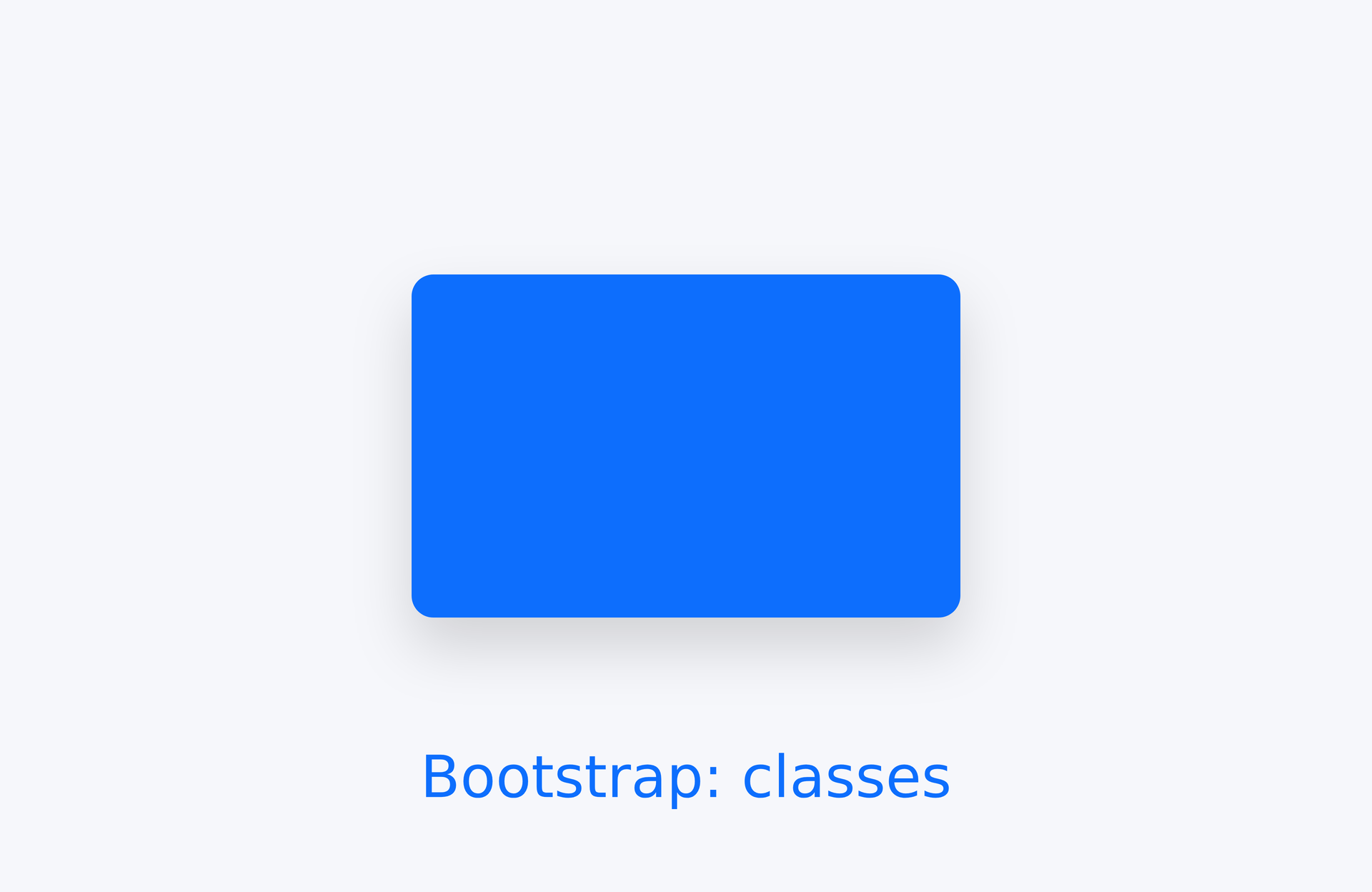
page=canvas(size=(100mm,65mm),stylesheet="@laymesh/bootstrap.css",background="#f6f7fb")card=page.add(rect(size=(40mm,25mm),class="bg-primary rounded shadow"),anchor=center,target=page.center)page.add(text("Bootstrap: classes",class="text-primary"),anchor=top_center,target=card.bottom_center,offset=(0mm,8mm))Preview
Dependencies
examples/libraries/bootstrap.lay
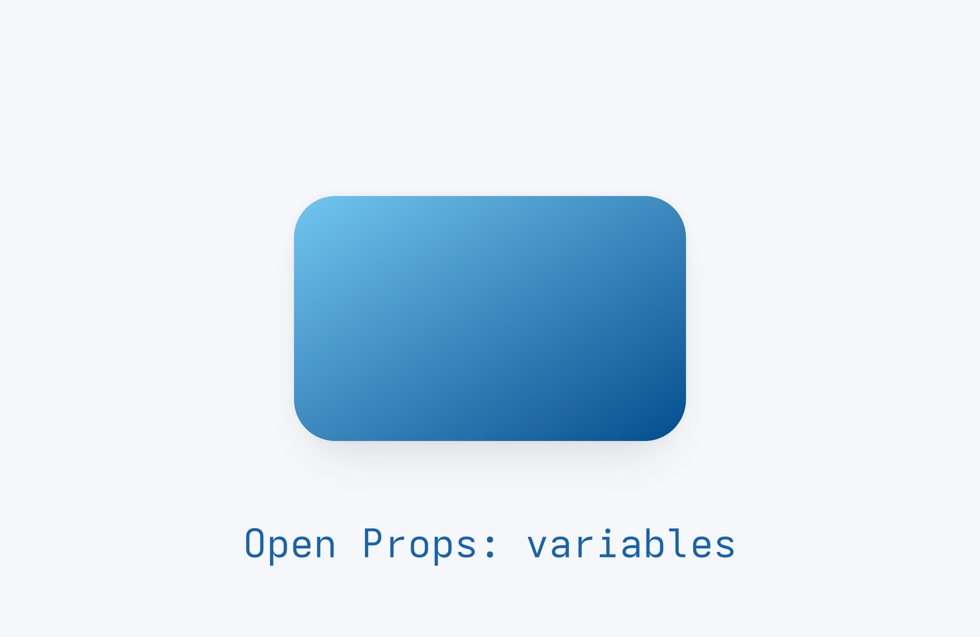
page=canvas(size=(100mm,65mm),stylesheet="@laymesh/open-props.css",background="#f6f7fb")style { .card { background:var(--gradient-7);border-radius:var(--radius-3);box-shadow:var(--shadow-3); } .label { color:var(--blue-9);font-size:4mm; }}card=page.add(rect(size=(40mm,25mm),class="card"),anchor=center,target=page.center)page.add(text("Open Props: variables",class="label"),anchor=top_center,target=card.bottom_center,offset=(0mm,8mm))Preview
Dependencies
examples/libraries/open-props.lay
page=canvas(size=(100mm,65mm),stylesheet="@laymesh/animate.css",background="#f6f7fb")card=page.add(rect(size=(40mm,25mm),fill="#0d6efd",border_radius=2mm),anchor=center,target=page.center)s=page.step(name="Entrance",start="after-previous",hold=1s)s.animate(card,class="animate__animated animate__fadeInUp",duration=800ms)Preview
Dependencies
examples/libraries/animate.lay
Bootstrap with motion: no authored CSS#
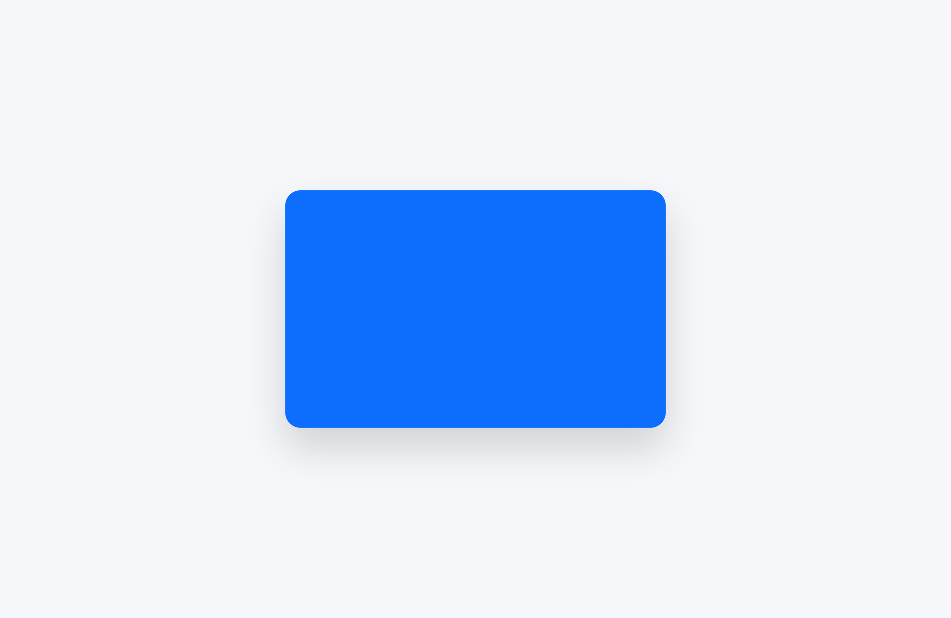
page=canvas(size=(100mm,65mm),stylesheet=["@laymesh/bootstrap.css","@laymesh/animate.css"],background="#f6f7fb")card=page.add(rect(size=(40mm,25mm),class="bg-primary rounded shadow"),anchor=center,target=page.center)s=page.step(name="Styled entrance",start="after-previous",hold=1s)s.animate(card,class="animate__animated animate__fadeInUp",duration=800ms)Preview
Dependencies
examples/libraries/bootstrap-animate.lay
bg-primary rounded shadow supplies appearance; animate__animated animate__fadeInUp supplies motion. after-previous starts on presentation entry. Omit it to wait for a click.
Open Props with motion: a small inline style block#
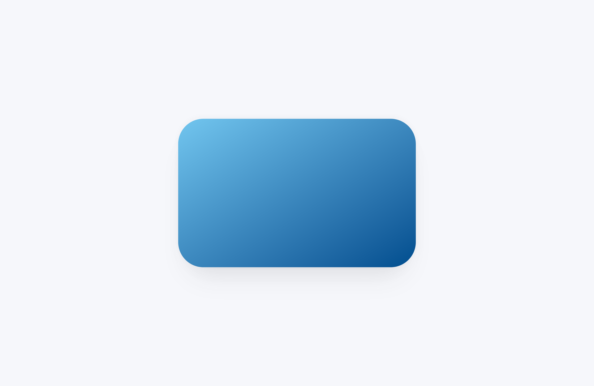
page=canvas(size=(100mm,65mm),stylesheet=["@laymesh/open-props.css","@laymesh/animate.css"],background="#f6f7fb")style { .card { background:var(--gradient-7);border-radius:var(--radius-3);box-shadow:var(--shadow-3); } }card=page.add(rect(size=(40mm,25mm),class="card"),anchor=center,target=page.center)s=page.step(name="Gradient entrance",start="after-previous",hold=1s)s.animate(card,class="animate__animated animate__fadeInUp",duration=800ms)Preview
Dependencies
examples/libraries/open-props-animate.lay
--gradient-7, --radius-3 and --shadow-3 paint the object; Animate.css controls its entrance. The project still uses a single .lay file.
Combine all three and override one field#
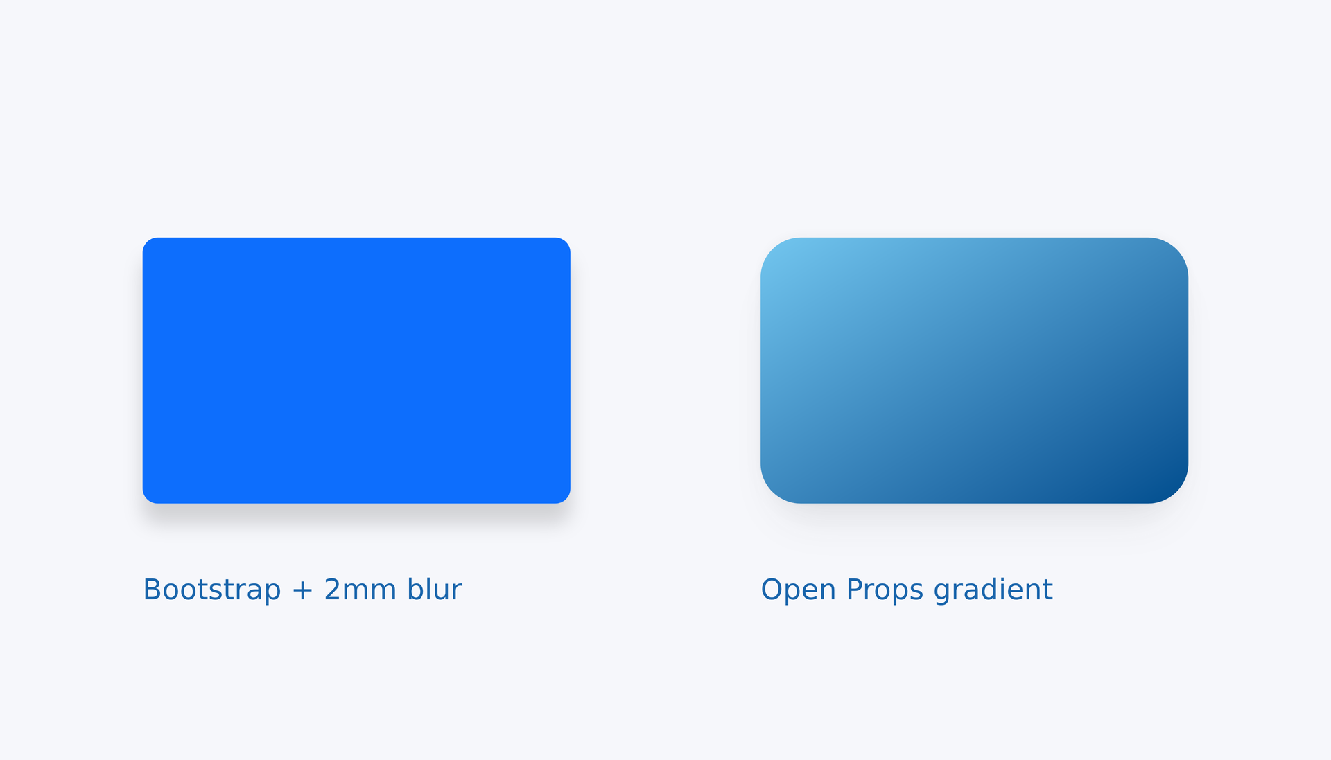
page=canvas(size=(140mm,80mm),stylesheet=["@laymesh/bootstrap.css","@laymesh/open-props.css","@laymesh/animate.css"],background="#f6f7fb")style { .ocean {background:var(--gradient-7);border-radius:var(--radius-3);box-shadow:var(--shadow-3);} .shadow.custom {box-shadow-blur:2mm !important;} .caption {font-size:3mm;color:var(--blue-9);}}records=[("bg-primary rounded shadow custom","Bootstrap + 2mm blur"),("ocean","Open Props gradient")]items=[]for appearance,label in records { target=page.top_left gap=(15mm,25mm) if len(items)>0 { target=items[len(items)-1].top_right gap=(20mm,0mm) } item=page.add(rect(size=(45mm,28mm),class=appearance),target=target,offset=gap) items=append(items,item) page.add(text(label,class="caption"),target=item.bottom_left,offset=(0mm,5mm))}s=page.step(name="Stagger",start="after-previous",hold=1s)for i,item in enumerate(items) {s.animate(item,class="animate__animated animate__fadeInUp",duration=800ms,delay=i*200ms)}Preview
Dependencies
examples/libraries/all-three.lay
Change only Bootstrap shadow blur to 2mm, preserving other fields. Importance and selector specificity match the library declaration. Loops retain instances and compute delay; anchors position cards and labels.
Next: parameters, reuse and third-party CSS#
- Selectors and cascade: explicit Lay parameters win; importance, specificity and order compare CSS declarations.
- Properties and units, shadows: change colors, corners and blur before relative units and expressions.
- Action parameters: duration, delay, iterations and scheduling.
- Shared themes and third-party CSS: extract a theme when files share appearance.
- Complete projects: progress to artistic text and the complex dashboard.
Versions and compatibility#
This guide describes current source builds; published packages follow their release notes. Unmodified upstream CSS loads, with appearance limited to LayMesh support. Dimensions, placement and data use Lay and anchors. Unsupported content is summarized; see compatibility.